IT'S ALL ABOUT PERSPECTIVE!
It's all about Perspective here at Winsor Gallery as we prepare for Patrick Hughes' forthcoming exhibition PERSPECTIVARIATIONS. As we prepare to install Patrick's work, we asked everyone at Winsor Gallery what their favourite Hughes piece was... below are the 'perspectivariations... responses.
WINSOR GALLERY FAVOURITES
SUNSHINE FRERE
My favourite Hughes work is not an original painting, but one of his quirky prints. I love Patrick's prints, they are brilliant. Liquorice Allsorts is my favourite, because I am a huge fan of organization. For example, this is one of my all time favourite Tumblr sites: http://thingsorganizedneatly.tumblr.com/
 Patrick Hughes
Liquorice Allsorts, 1973
Screenprint, Edition 75, 70 cm x 60 cm
KEVIN KRAUSSLER
“Brilliancy” is, in fact, my favorite Hughes piece. It’s animated juvenile quality really works with the cheeky nature of the visual illusion. It’s such a perfect marriage of form and content that way. I guess I like the whimsy of it!
 Patrick Hughes
Brilliancy, 2008
Oil on board construction, 18 x 32 x 11.5"
BELINDA SIU
I really like Koons Poodles not only because of its amazing glint and shine, but also because it is a great example of Patrick Hughes' Warholian interest in appropriating already celebrated imagery. The Koons Poodles are iconic in their own right, but Patrick makes them spectacular in a different way.
 Patrick Hughes
Koons Poodles, 2011
oil on board construction, 53 x 157 x 20 cm
I have so many favourites, I found it hard to choose. So I'm also going to include Weather Cock and Sunshine in the list. They are just so witty and tongue-in-cheek, loving them is hard to resist.

ALEX M.F. QUICHO
 Patrick Hughes
Crash Landing, 1981
Colour screenprint, 56 x 75 cm
ALEXIA ANASTASIOU
I am fond of Patrick's prints, and my favourite reverspective painting is definitely Brilliancy. All time favourite print? The Studio.
 THE STUDIO, 1987
Screenprint with hand colouring
Edition of 60, 31 x 24” / 80 x 60 cm
NATHAN ZEITNER
My preferred print...

PAPER ROSES, 1985
Screenprint, Edition of 150
76 x 56 cm / 30 x 22 in
Make sure to join us on the 3rd for Patrick's exhibition opening, Hughes' Perspectivariations, will be just that, full of perspective, and reverspective.
Patrick Hughes - Corner Stores from Patrick Hughes on Vimeo.
WINSOR GALLERY FAVOURITES
SUNSHINE FRERE
My favourite Hughes work is not an original painting, but one of his quirky prints. I love Patrick's prints, they are brilliant. Liquorice Allsorts is my favourite, because I am a huge fan of organization. For example, this is one of my all time favourite Tumblr sites: http://thingsorganizedneatly.tumblr.com/
Liquorice Allsorts, 1973
Screenprint, Edition 75, 70 cm x 60 cm
KEVIN KRAUSSLER
“Brilliancy” is, in fact, my favorite Hughes piece. It’s animated juvenile quality really works with the cheeky nature of the visual illusion. It’s such a perfect marriage of form and content that way. I guess I like the whimsy of it!

Brilliancy, 2008
Oil on board construction, 18 x 32 x 11.5"
BELINDA SIU
I really like Koons Poodles not only because of its amazing glint and shine, but also because it is a great example of Patrick Hughes' Warholian interest in appropriating already celebrated imagery. The Koons Poodles are iconic in their own right, but Patrick makes them spectacular in a different way.
Koons Poodles, 2011
oil on board construction, 53 x 157 x 20 cm
I have so many favourites, I found it hard to choose. So I'm also going to include Weather Cock and Sunshine in the list. They are just so witty and tongue-in-cheek, loving them is hard to resist.
Patrick Hughes
Weather Cock, 1979
colour screenprint, edition of 100, 57.5 x 40 cm
Patrick Hughes
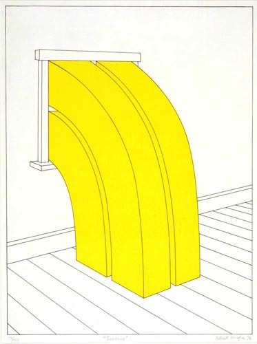
Sunshine, 1974
colour screenprint, edition of 75, 81.2 x 61 cm
ALEX M.F. QUICHO
Crash Landing is a favourite of mine because it's simple, clever, and a little bit hopeful and sad at the same time. It's ordered but awkward, and therefore endlessly endearing! The way the buildings are printed reminds me of a very specifically New Yorker type of illustration. Maybe it's for this reason that Crash Landing makes me nostalgic for chilly mornings, big cities, and simpler times.
Crash Landing, 1981
Colour screenprint, 56 x 75 cm
ALEXIA ANASTASIOU
I am fond of Patrick's prints, and my favourite reverspective painting is definitely Brilliancy. All time favourite print? The Studio.
Screenprint with hand colouring
Edition of 60, 31 x 24” / 80 x 60 cm
NATHAN ZEITNER
My preferred print...
PAPER ROSES, 1985
Screenprint, Edition of 150
76 x 56 cm / 30 x 22 in
Make sure to join us on the 3rd for Patrick's exhibition opening, Hughes' Perspectivariations, will be just that, full of perspective, and reverspective.
Patrick Hughes - Corner Stores from Patrick Hughes on Vimeo.
Comments
Post a Comment